Utonallo
A boutique restaurant needing a digital transition. Traditional menus failed to capture the sensory experience of their food, and the existing ordering process felt cold and disconnected from the brand's culinary philosophy.
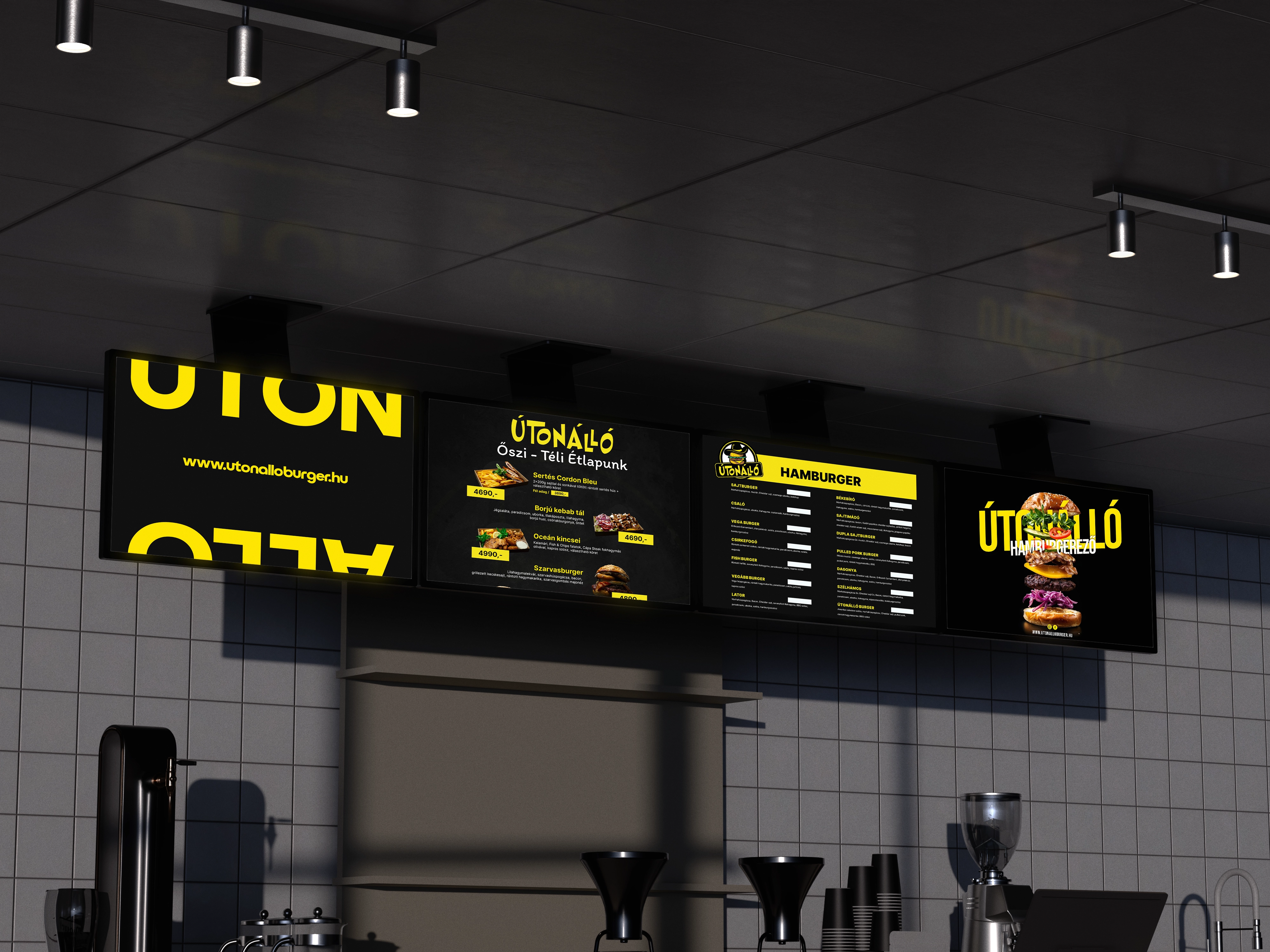
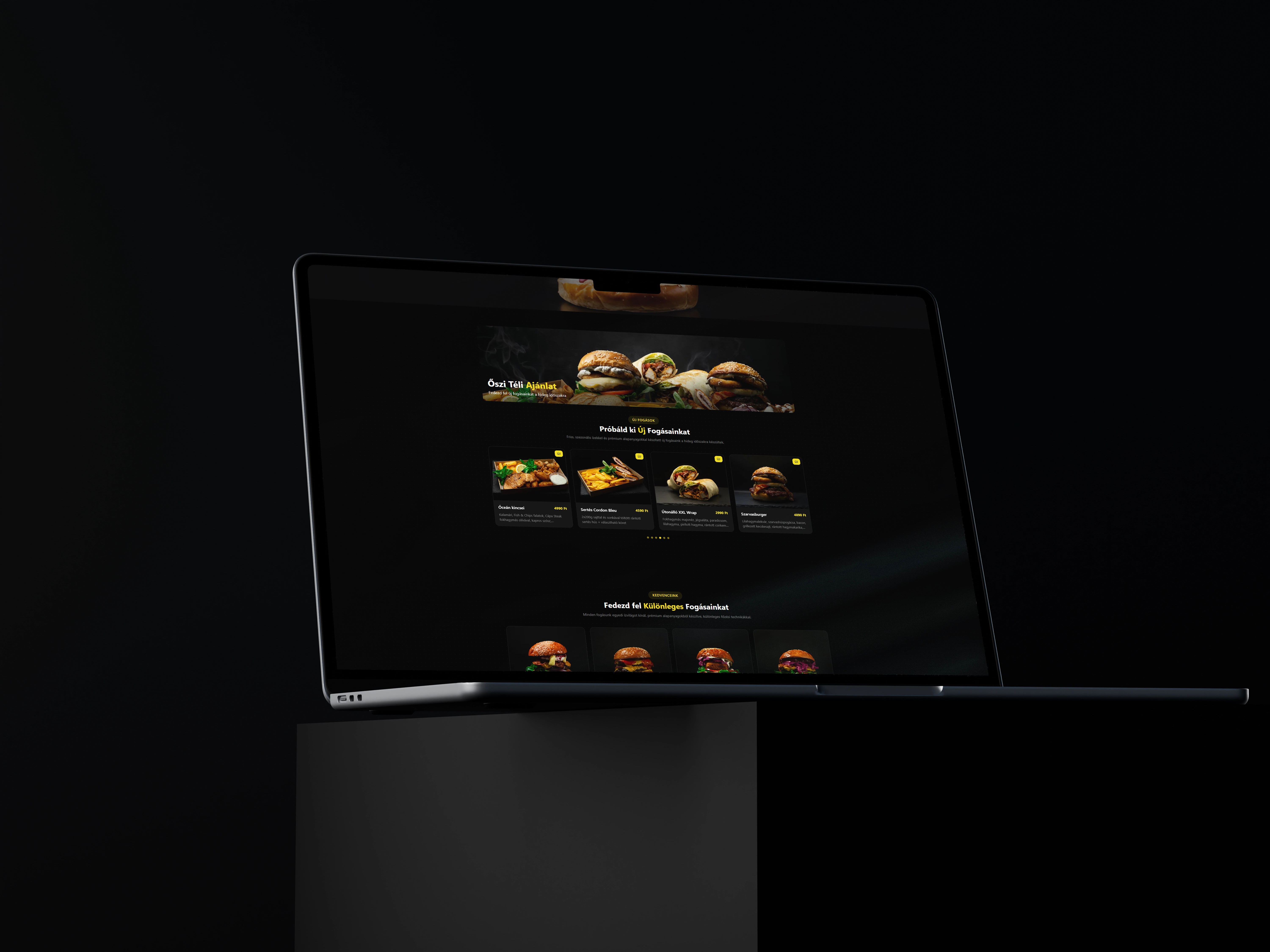
A digital-first menu system that prioritizes high-fidelity photography and fluid motion. We created a 'taste with your eyes' experience, using a bento-grid layout that adapts perfectly across mobile and tablet devices.
LOGOTYPE
GEOMETRY
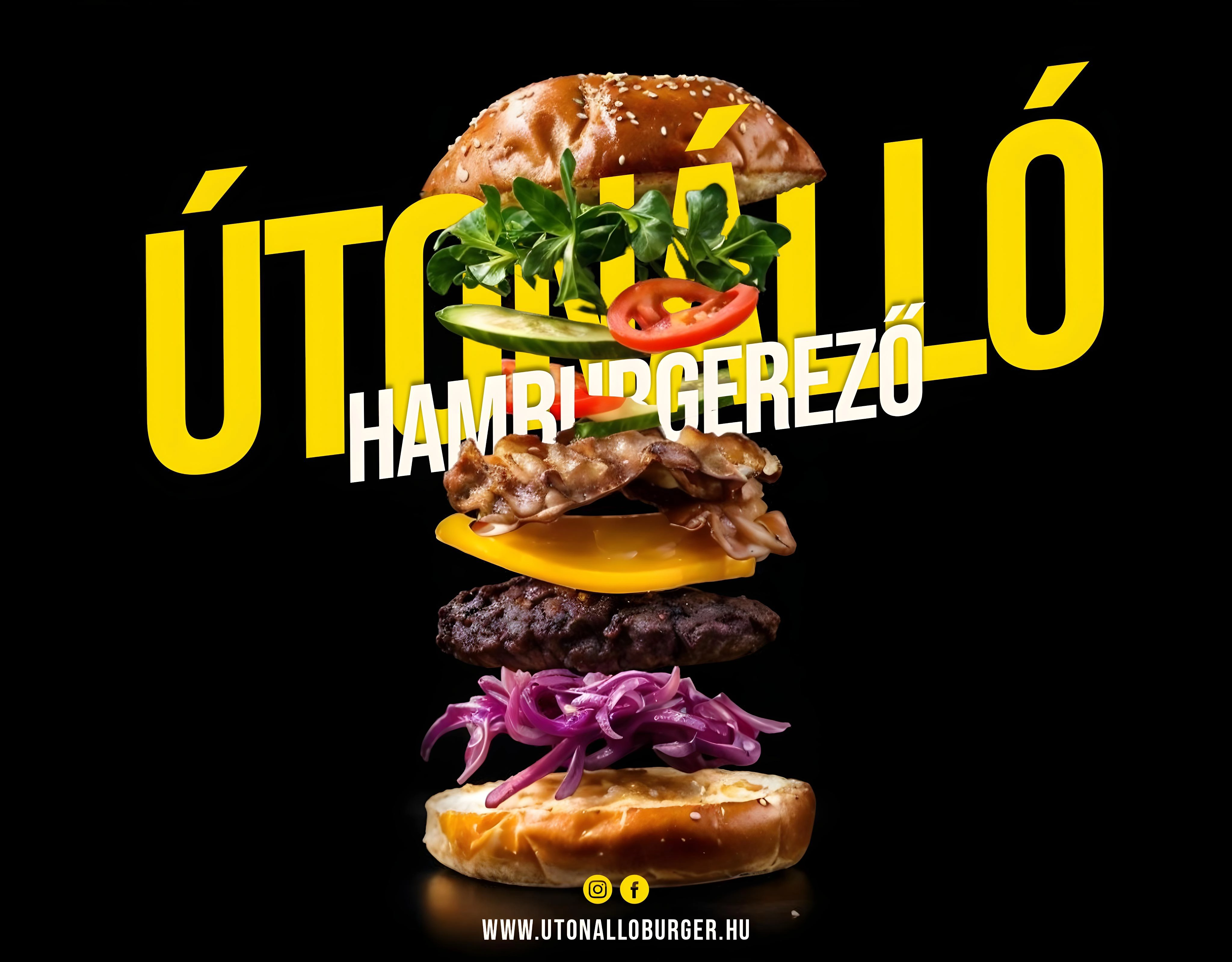
This project focused on brand alignment, not redesign. By staying loyal to the original logo type, every supporting visual was crafted to feel like a natural extension of the mark. Consistency became the strategy — turning a standalone logo into a unified, recognizable brand system.
Geist
Sans
A functional, highly legible sans-serif designed for precise interfaces and seamless digital experiences.
Production
EXP_RESULTS_V1