Hazepitok
A regional construction company was completely invisible online. Their craftsmanship was exceptional, their brand was nonexistent — no digital presence, no cohesive identity, just a phone number and a handshake reputation that couldn't scale beyond word of mouth.
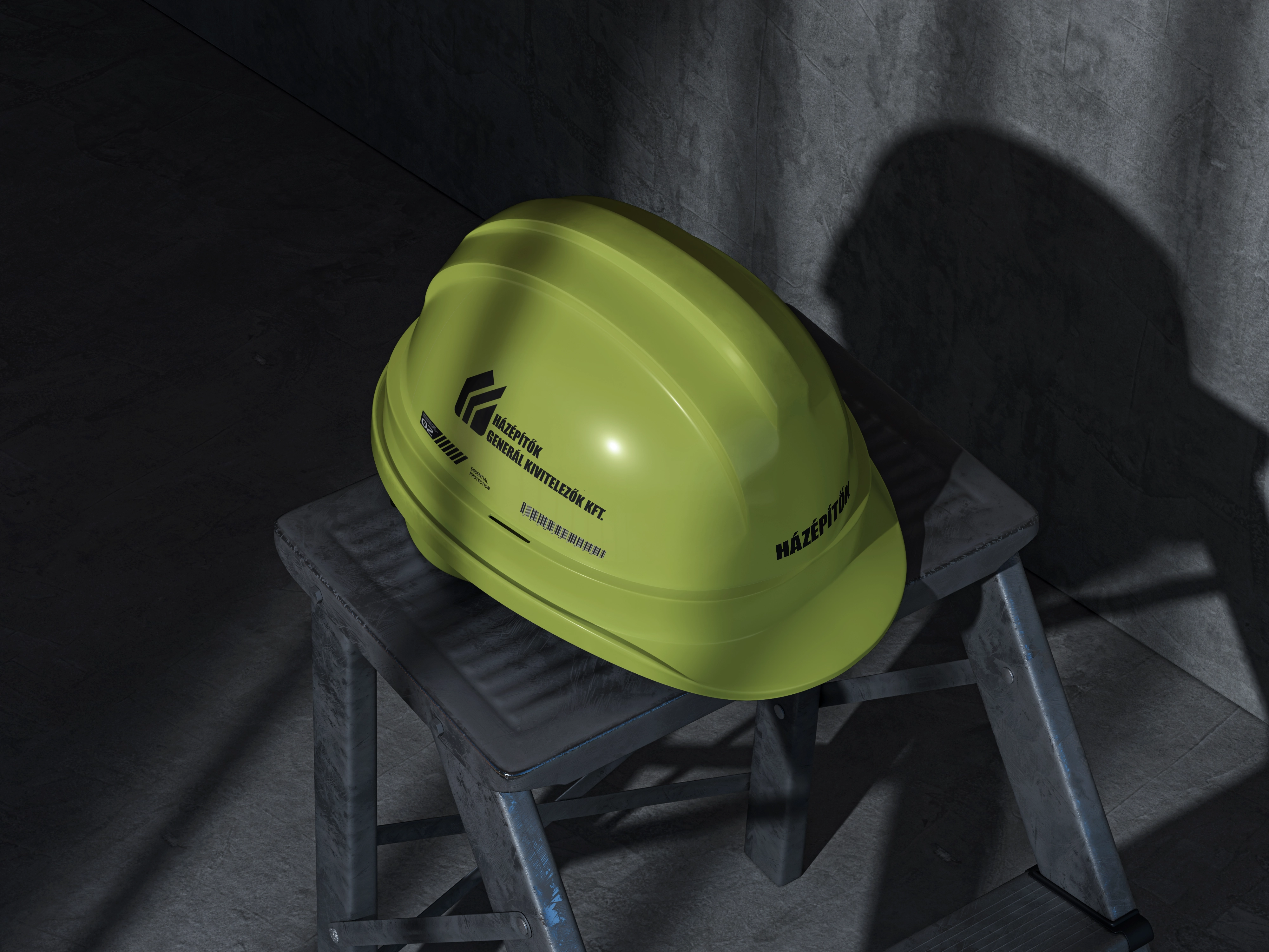
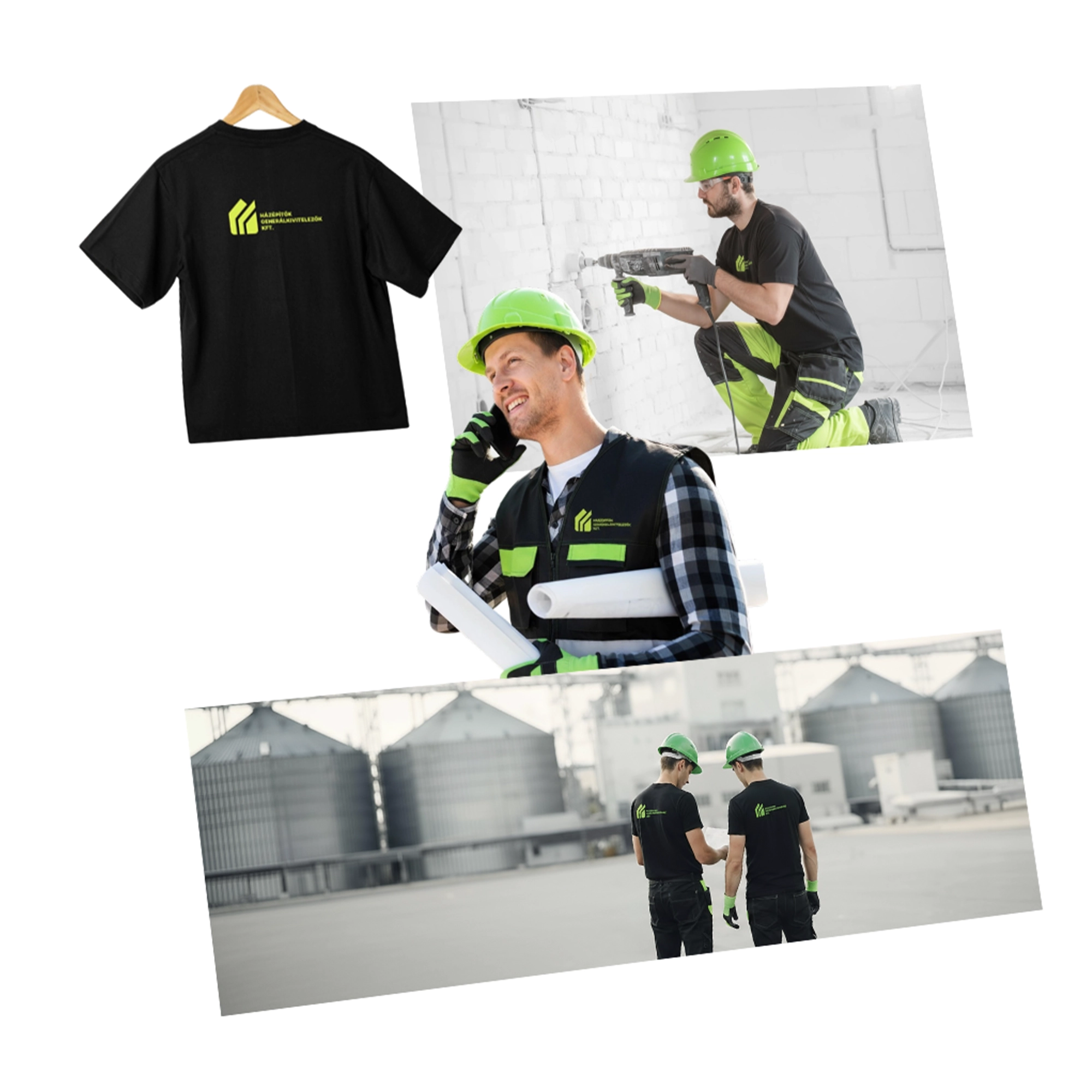
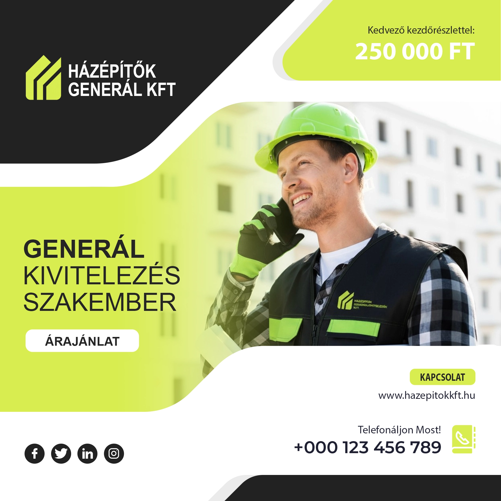
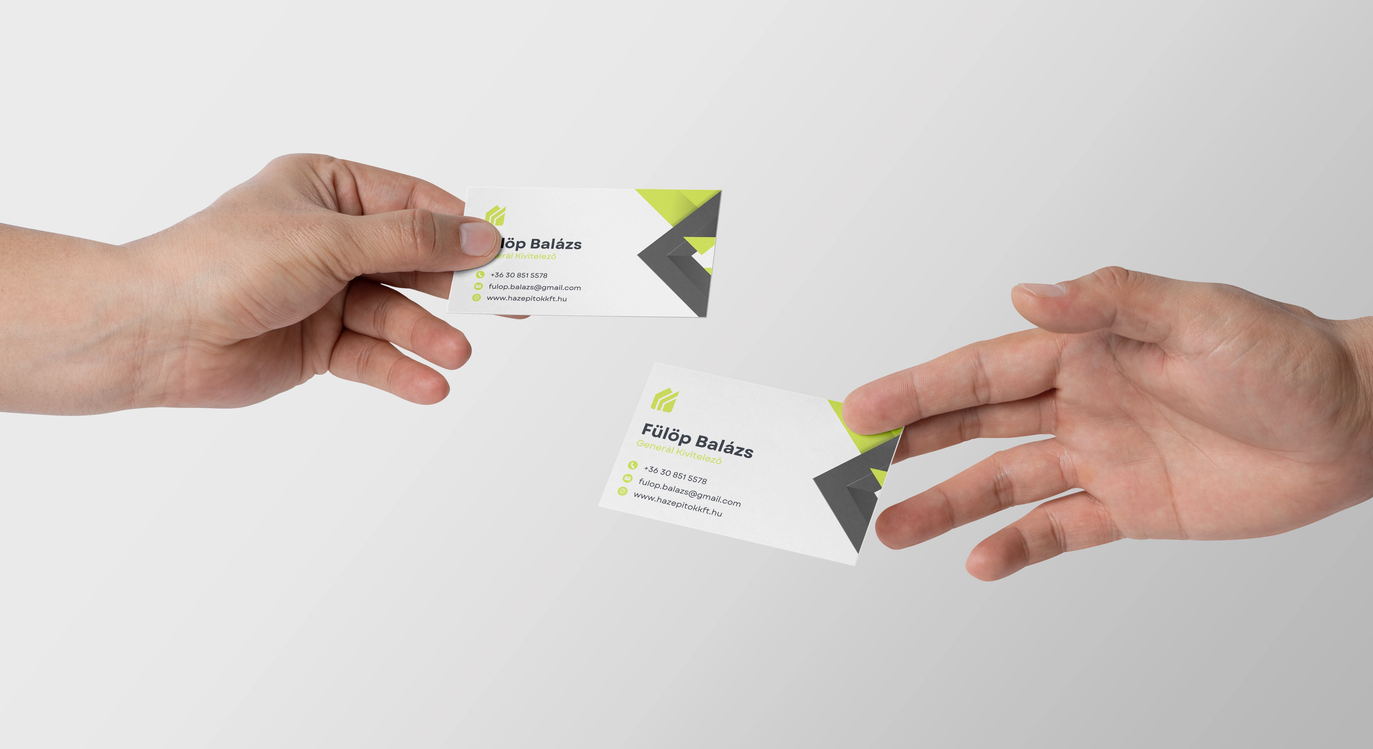
A bold, system-driven brand identity built on structural logic. Dominant volt green signals reliability and modernity against a brutalist charcoal base. A fully optimised digital presence that turned an invisible operation into the most recognisable contractor in their market.
LOGOTYPE
GEOMETRY
The Hazepitok logo features a strong, structured design that resembles the shape of a house, symbolizing stability, protection, and craftsmanship. Its clean lines and solid form reflect reliability and precision, capturing the essence of a trusted construction company while maintaining a modern and professional appearance.
Satoshi
A modern geometric sans-serif with engineering precision. Every letterform is clean, purposeful, and built to last — just like the structures this brand represents.
Production
EXP_RESULTS_V1