Dudocutz
A local barbershop struggling with disjointed scheduling and a brand identity that didn't reflect their premium, precision-focused service. The booking experience was friction-heavy, leading to missed appointments and customer frustration.
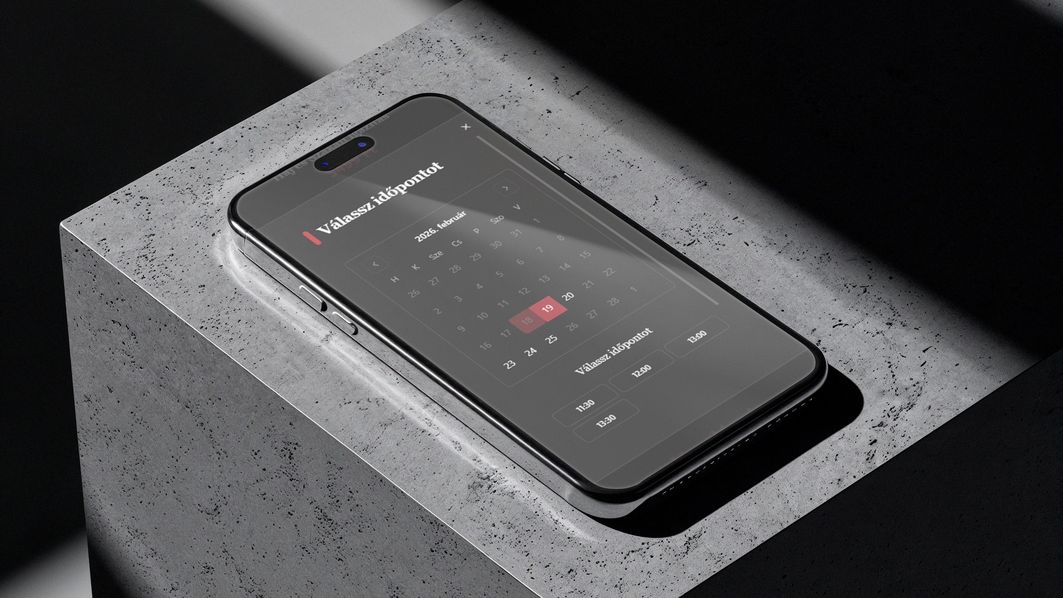
We engineered a high-performance booking engine integrated with a stark, brutalist brand identity. The UI focuses on speed and clarity, reducing booking time to under 45 seconds while establishing a dominant visual presence.
LOGOTYPE
GEOMETRY
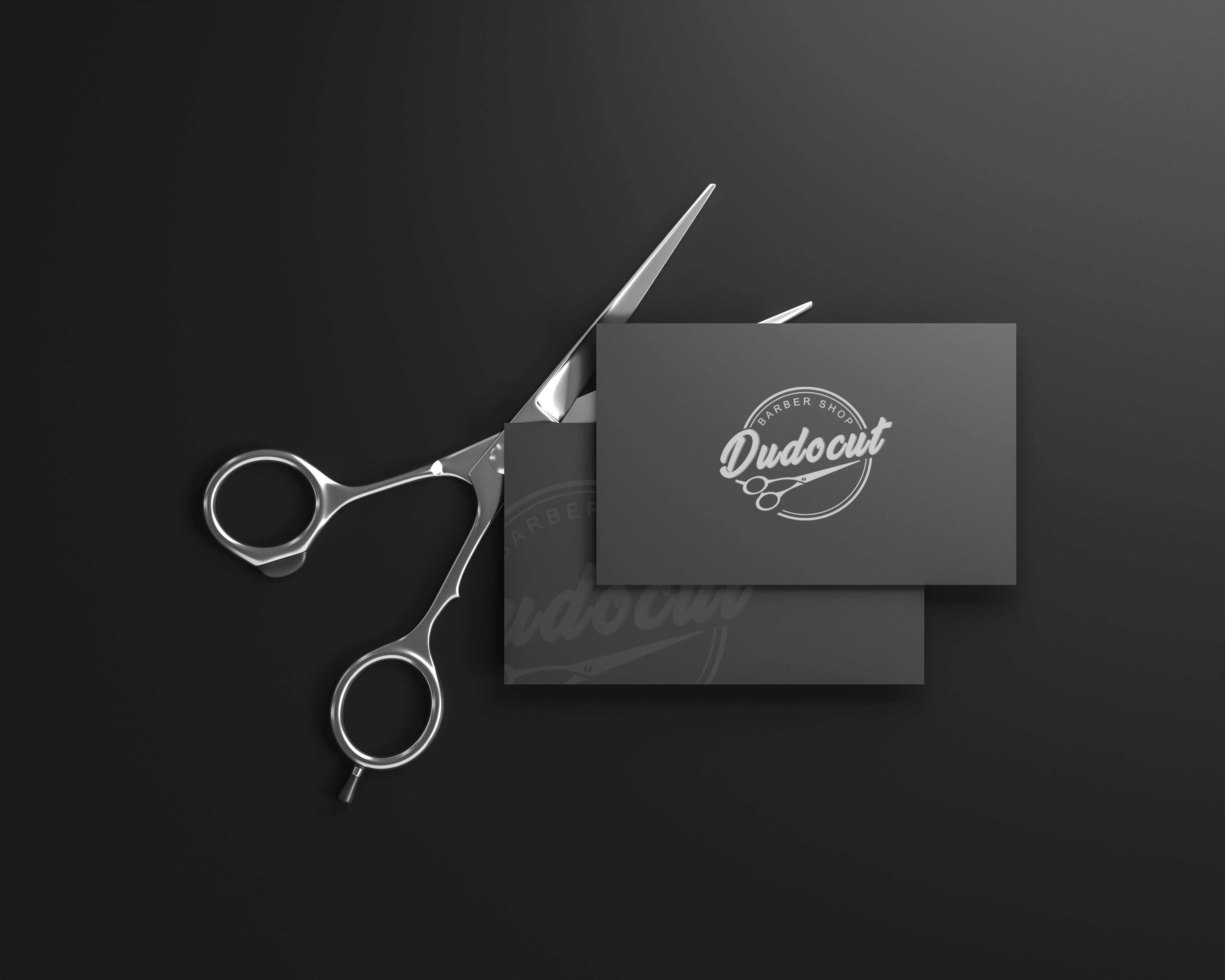
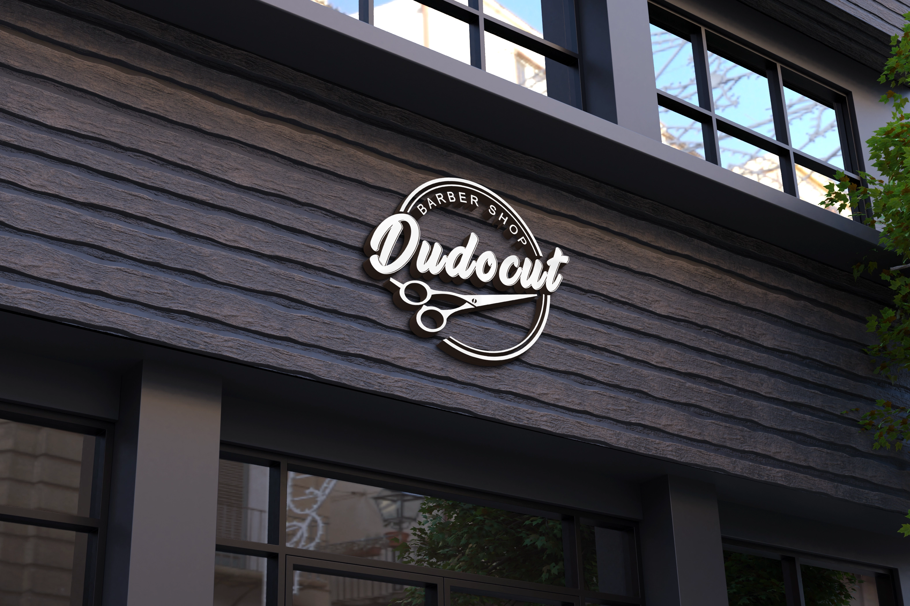
A modern take on a classic barbershop emblem. The circular badge structure delivers heritage and credibility, while the bold script wordmark adds confidence and personality. The scissor icon reinforces precision — reflecting the shop’s premium, detail-oriented service. The identity doesn’t reinvent barber culture — it sharpens it.
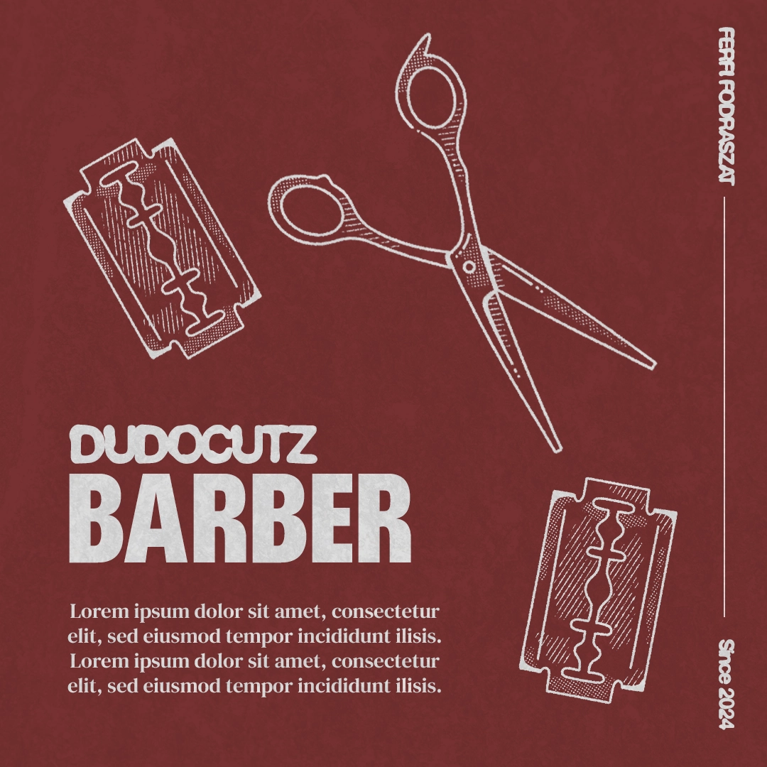
Playfair Display
Inter
A combination of elegant Playfair Display for headers and the clean Inter for body text. It balances the premium barbershop experience with functional booking.
Production
EXP_RESULTS_V1