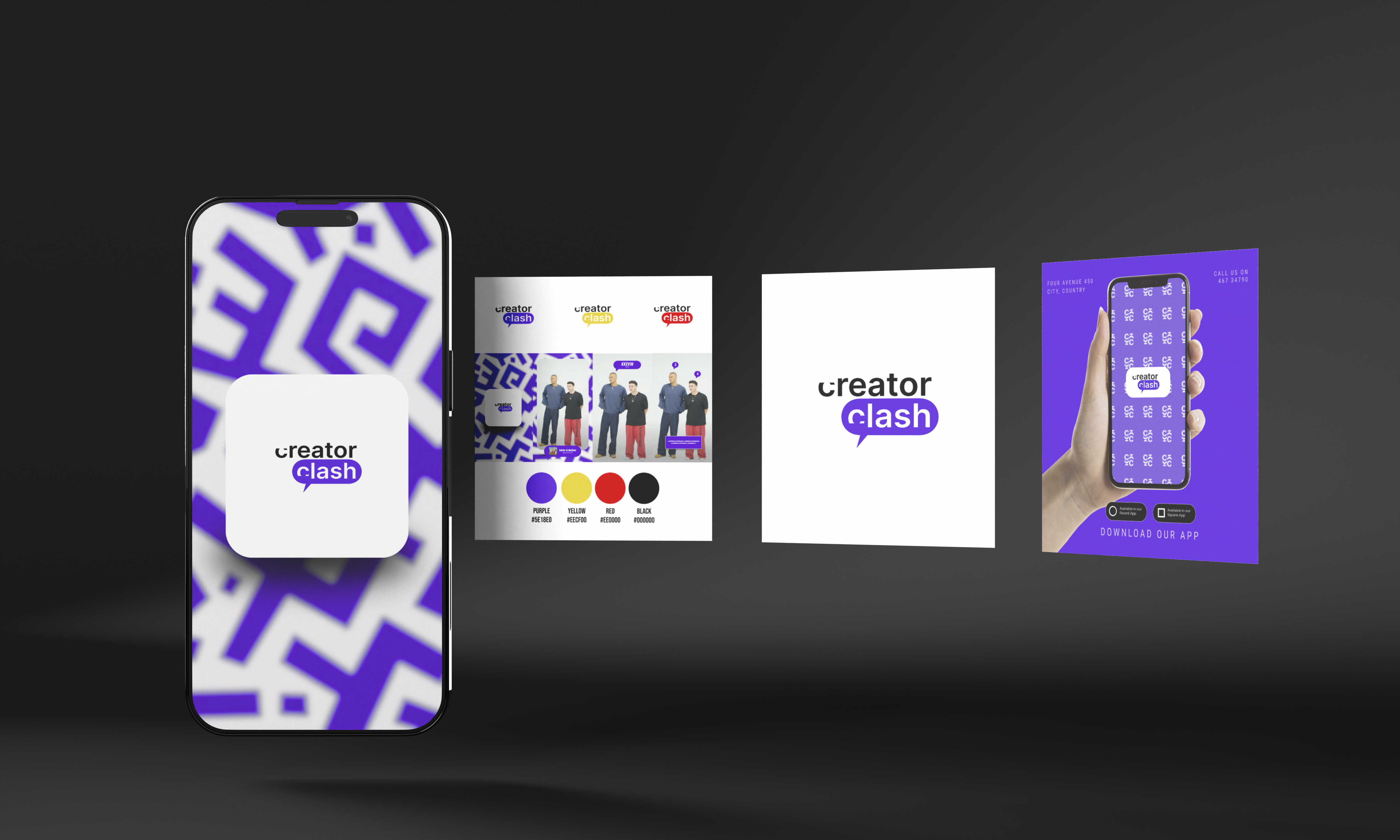
Creator
A social media brand producing viral, celebrity-driven contest content had zero visual identity to match their disruptive energy. Their presence was chaotic, inconsistent, and forgettable in an oversaturated feed.
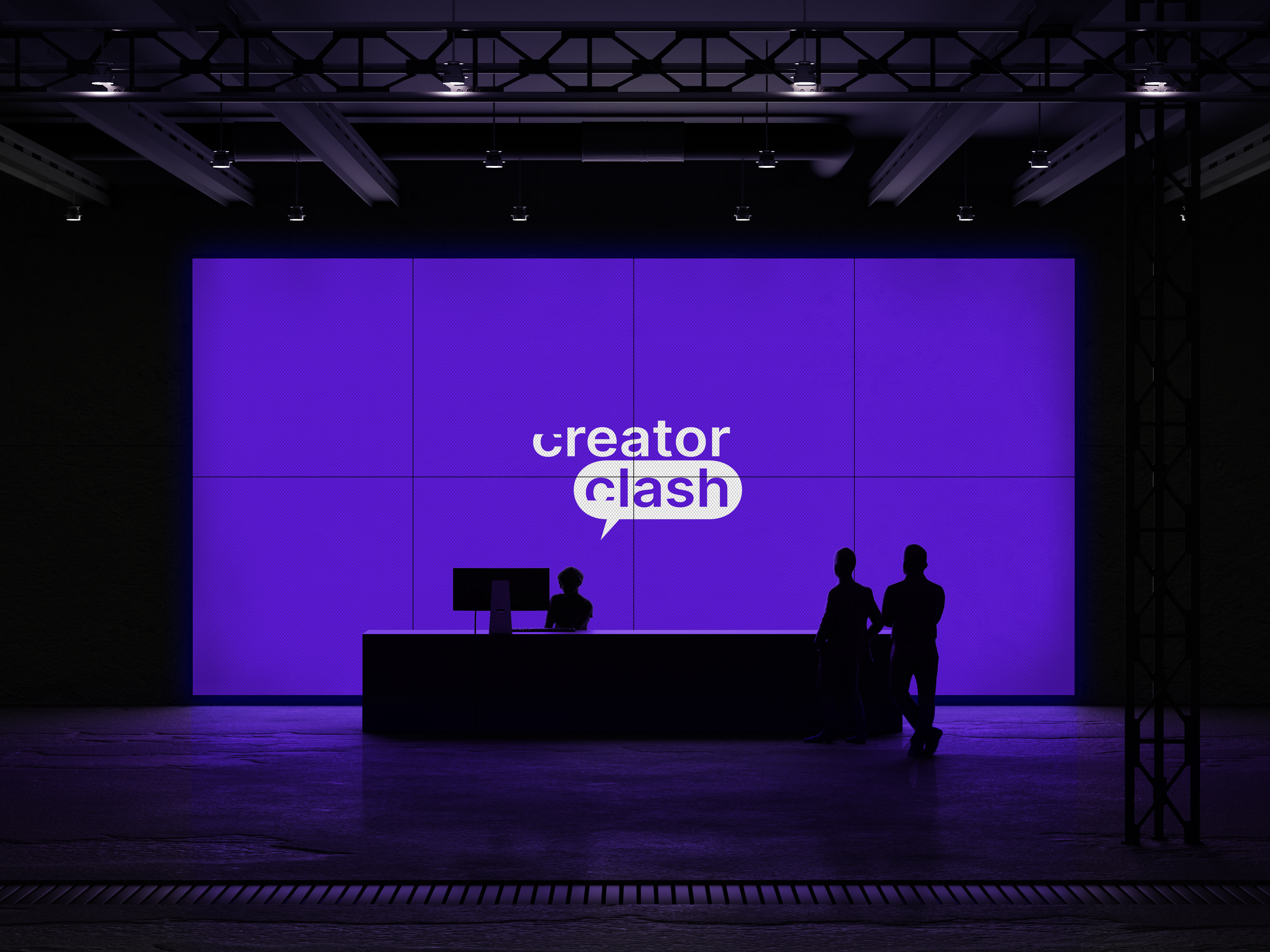
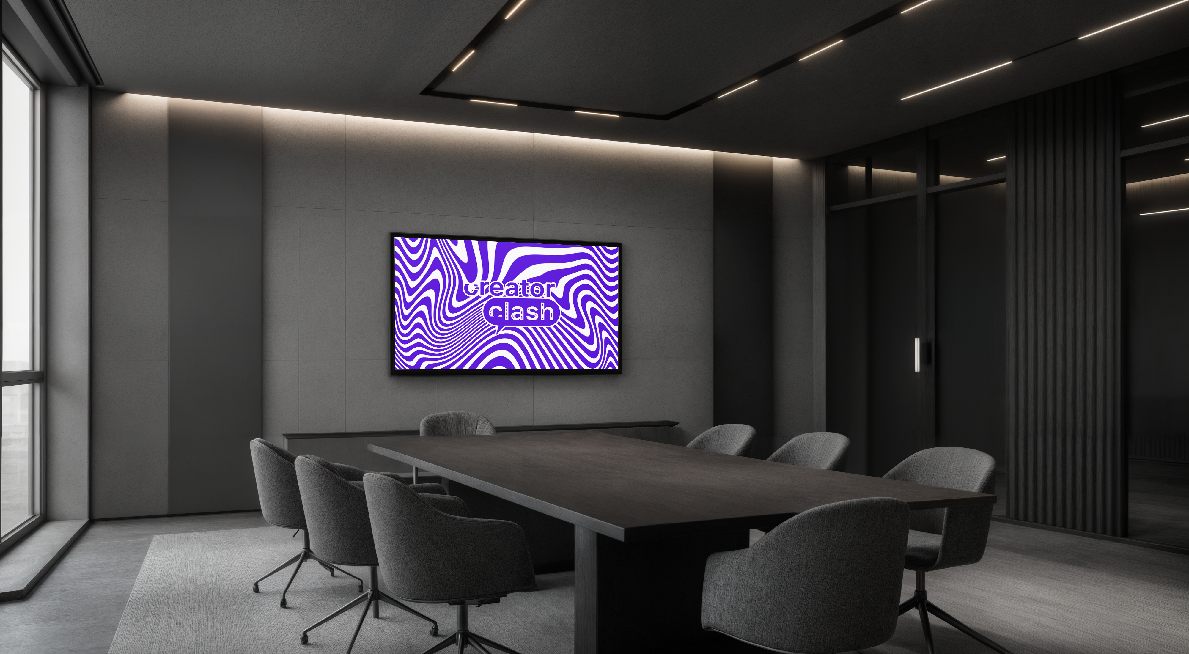
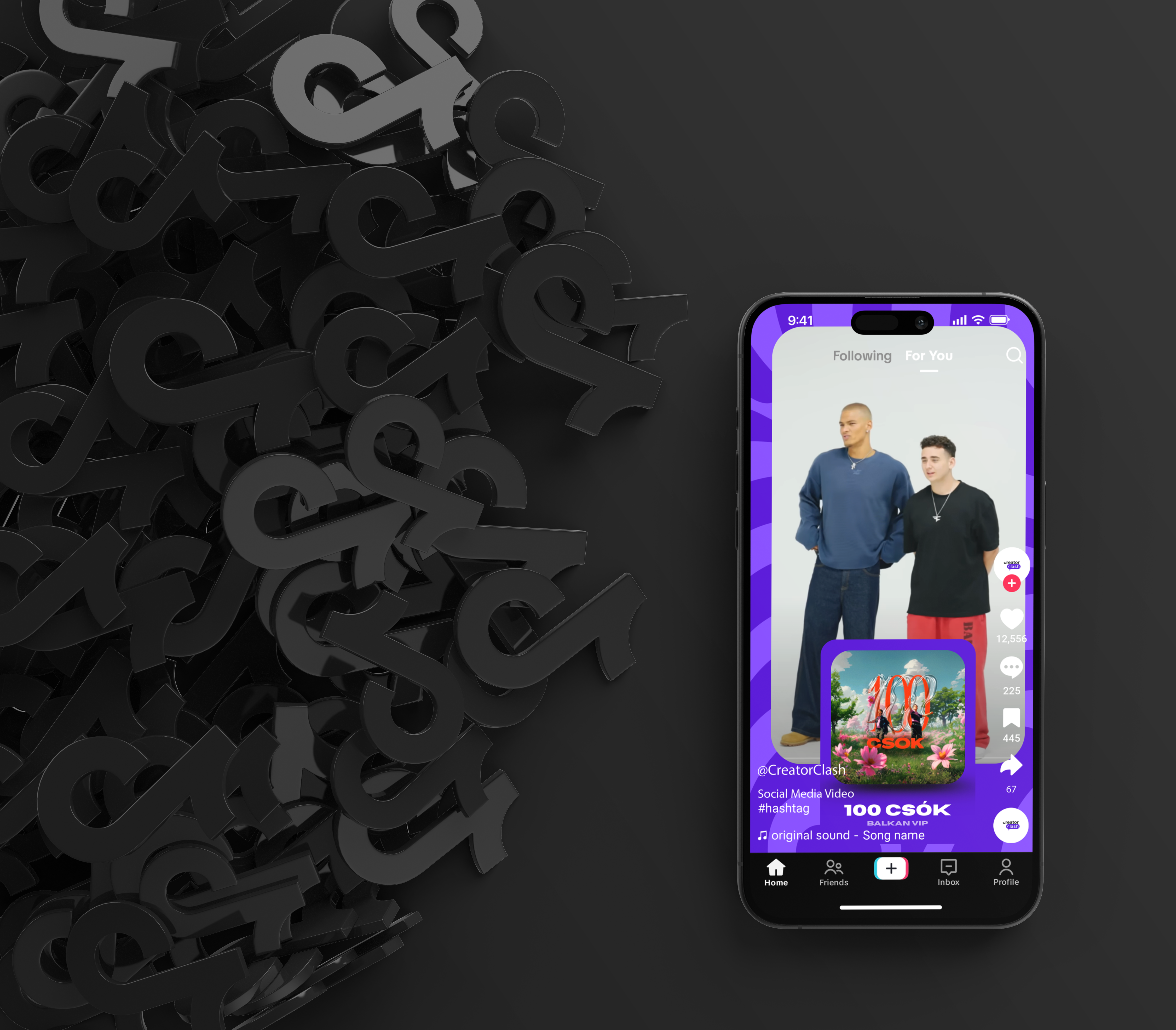
We built a visual system that commands attention in 0.3 seconds. Aggressive condensed typography, electric violet, and a brand language designed purely for vertical scroll — where every post, thumbnail, and overlay is a weapon of engagement.
LOGOTYPE
GEOMETRY
A bold, modern wordmark paired with a vibrant purple speech bubble captures the energy of viral creator battles. The strong typography builds credibility, while the chat-inspired shape reinforces social engagement and competitive interaction. Simple, disruptive, and built for digital.
Bebas
Neue
A condensed display typeface engineered for maximum impact. Zero compromise, maximum weight. The visual equivalent of a title card dropped in the feed.
Production
EXP_RESULTS_V1